How To Create A Chart in Microsoft Excel?
In Microsoft Excel a powerful tool that we can use to visually display data graphically is named a Chart. A Chart is often named as a Graph. It visually represents Data from a Worksheet, which helps us understand the Data much easier rather than just looking at the numbers. It allows us to see the real meaning behind the numbers. There are a lot of Chart Types that we can use such as Bar, Column, Pie, Line, Scatter and many other more. In this video, I will display How to Create a Pie Chart quickly and easy. Stay Tuned to find out how.
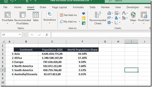
In the next image we can see that the Worksheet contains Data such as the Continents the Population of each Continent and the World Population Share of each Continent. As mentioned, the best way to understand the Data is to Visualize them by creating a Chart.
I have selected the area of Data which I want to visualize by creating a Chart. The area that I have selected is the B1:C8, which is the Continents and the Population of 2020. Once the area is selected, we select the Insert tab of the ribbon as shown in the image below.
From the Insert tab of the ribbon, we locate the area named Charts and if we cannot make up our mind which Chart to use, we can select the Recommended Charts command as shown. Once the Recommended Charts command is selected, the Insert Chart dialog box appears, suggesting us according to the selected Data a list of Recommended Charts to use. The choice is ours to make. In the example below, I have selected the Pie Chart where in the right of the Insert Chart dialog box we also have a preview of how the Chart will look like. We are also notified that: A Pie Chart Is Used To Show Proportions Of A Whole. Use It To Show Numbers That Relate To A Larger Sum And Always Equal 100%. Do Not Use This Chart If It Contains Many Slices As Angles Are Hard To Estimate. If we are satisfied, we just press the Ok button, and the Chart will be created.
If we already know, which Chart we want to create, from the Insert tab of the ribbon and under the area named Charts we select the Chart that we want to use. As mentioned, there are many Charts that we can use such as Bar, Column, Pie, Line, Scatter and many more. In the image below, I have selected the Pie Chart and from the drop-down menu I have navigated on top of the 3-D Pie Chart. In the informational window, we are notified that:
-
We Can Use This Chart Type To: Show Proportions of a Whole.
-
Use it When: Numbers Equal 100%.
-
The Chart Contains Only A Few Pie Slices (Many Slices Make The Angles Hard To Estimate).
If we are happy with the 3-D Pie Chart, we just select it and the Chart Pie will be created and inserted into the current Worksheet as an Object as shown below.
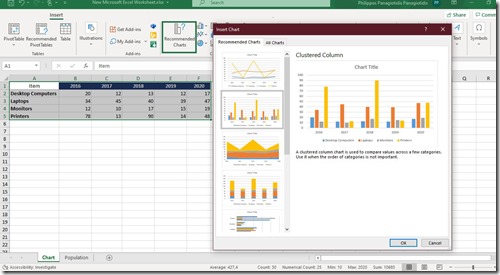
In the following image, I have selected different Data from a different Worksheet, and then selected the Insert tab and from the area of the ribbon named Charts, I selected the Recommended Charts command. The Insert Chart dialog box appears, where I selected the Clustered Columns Chart where at the right, we have a preview how our Data will look like as a Chart. We are also notified here that: A Clustered Column Chart Is Used To Compare Values Across A Few Categories. Use It When The Order Of Categories Is Not Important. If we are satisfied with the Clustered Columns Chart, we just press the Ok button located at the bottom right corner of the Insert Chart dialog box.
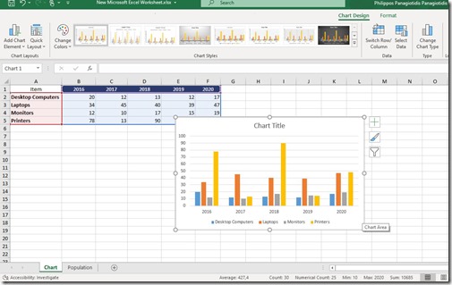
In the image below, we can see the Clustered Columns Chart inserted in the current Worksheet among with its Data. Also, the Chart Design tab is activated, which we can use to Modify our Chart and which will be described in another post of mine.
Just keep in mind that the visualization of our Data into a Chart does not always leave us satisfied. Depending on the Data that we are using we must find the corresponding Chart also. As mentioned, there are many more Charts to use, which will fit perfectly for our Chart.
Below you can check out the video describing How To Create A Chart in Microsoft Excel?
and…
Don’t Forget To Subscribe To My YouTube Channel!!!
This entry was posted in Word 365 ProPlus English and tagged 3-D Pie Chart, Bar, Categories, Chart, Chart Design tab, Clustered Column, Column, Continent, Data, Graph, How To, How To Create A Chart in Microsoft Excel, Insert Chart, Insert tab, Know How, Line, Microsoft Excel, Microsoft Office, Microsoft Outlook, Microsoft PowerPoint, Microsoft Word, Modify, My YouTube Channel, Object, Office Smart, Office System, OfficeSmart, philippospan, Pie, Pie Chart, Recommended Charts, Scatter, Show Proportions of a Whole, Smart Office, smartoffice, Subscribe, Tip & Tricks, Visualize, Worksheet, World Population.


